Sketch to digital: City of Stolen Magic book cover illustration
Hello friends! Welcome to my blog.
From the moment I learned about the Penguin Cover Design Awards, I knew I had to take part in it. When I saw they had a children’s book category I was so excited! In my spare time I had been creating book cover illustrations for children’s classics such as; Anne of Green Gables, The Wind in the Willows and James and the Giant Peach. So, I felt this was the perfect opportunity to participate in something I feel really passionate about.
I thought I’d talk to you a bit more in depth about my process. This is just what worked for me, but I hope you can take something away from it or apply this to other projects.
Before I started reading the book I read the brief, if you’re interested in the details, you can find more information here. City of Stolen Magic is a spellbinding fantasy adventure, aimed at children ages 9-11. The brief asks for a front & back cover design that showcases the book in an imaginative and engaging way.
I made a TikTok about it in my Artist Diaries series. Although, I must admit, I was going through a phase where it took me a while to focus when reading a book, but once I was in the right mindset, I found myself completely engrossed in the book. I highly recommend it.
Whilst it was all fresh in my mind, I started taking notes straight away. I listened to a few interviews on YouTube where the author Nazneen Ahmed Pathak talks about the book. This gave me insight into her background, why she wrote the book and the meaning behind the story. I think this was a key part to the research stage as it gave me a deeper understanding of the book and how I can try to implement some of the history into my design. I love that there were metaphors behind almost everything and so I looked out for things I could use in the cover such as descriptions of the characters, important items, and the overall theme of the story.
Starting with brainstorming ideas is a great way to get the creative juices flowing. For me, it's always helpful to browse around a bookshop and take a look at the covers that catch my eye. I pay close attention to the font style, colour palettes, character illustrations, and overall composition. It's amazing how much you can learn about what works and what doesn't just by looking at what draws you in!
Even when sketching out thumbnails I like to fire up my trusty Procreate app on my iPad. I love working digitally for this stage of the process, as it allows me to quickly change the positions of various elements and experiment with different colour schemes.
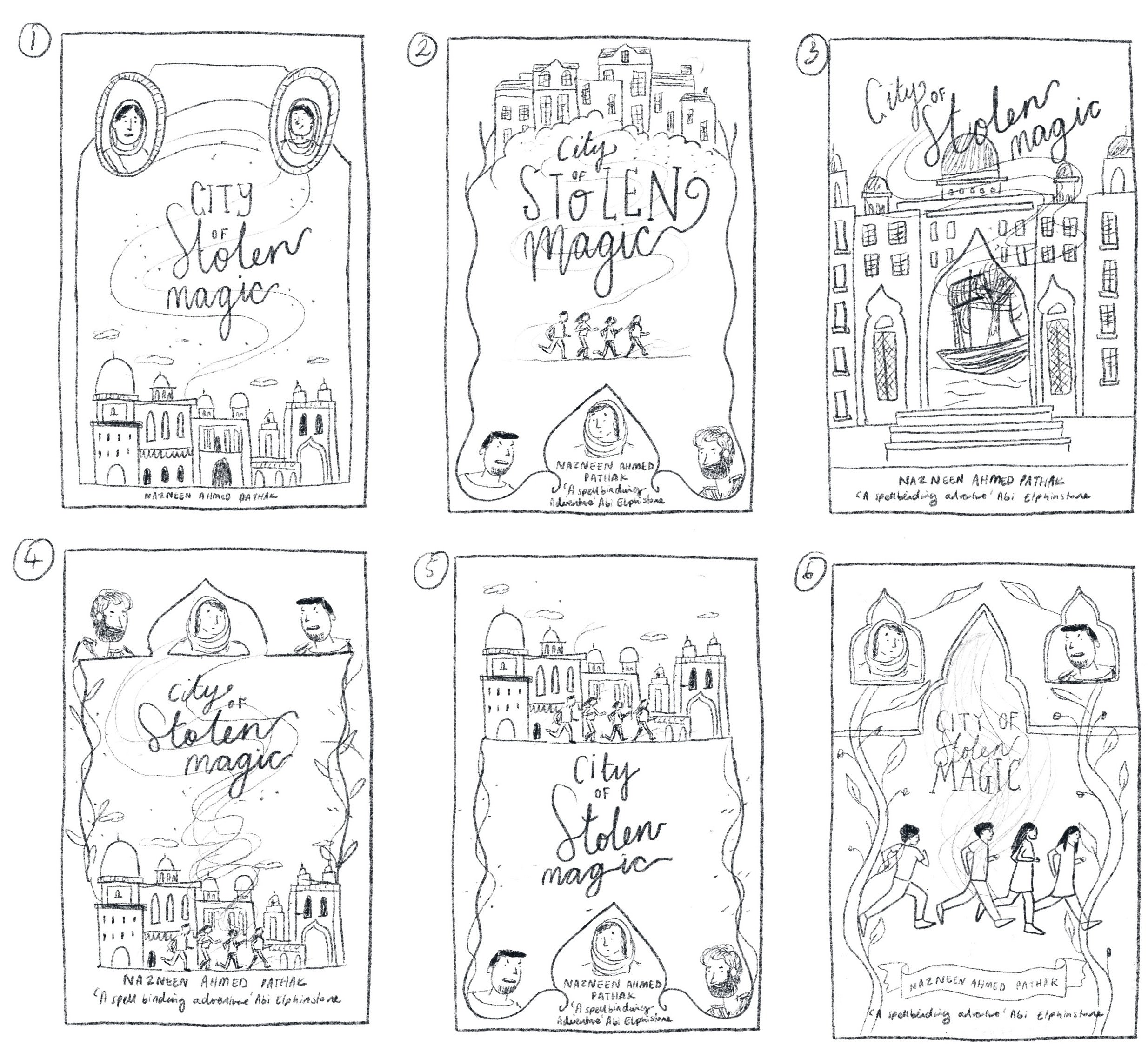
I wanted to include all four main characters - Chompa, Leeza, Laurie, and Tipu - on the front cover. However, I also realised that Ammi and Devaynes played a significant role in the story, which made me feel overwhelmed. So, I tried out a few ideas to see how I could incorporate everyone or something symbolic into the design. Which sketch do you like the most?
I really liked the idea of having an Indian architectural art outline border as the main feature of the cover. In addition, I thought it would be great to have the four main characters running as if they are trying to escape from the villain, Devaynes. This way, I could highlight the main characters while also setting the theme of the story and creating a sense of tension and excitement for the readers.
Choosing the perfect layout and color palette was a tedious process, and I found myself going back and forth multiple times. It became frustrating, and I started to worry that I wouldn't meet the deadline. Here are a few designs and color schemes that didn't quite make the cut.
I stopped midway because I just knew they weren't working. Although I liked some elements of the designs, the main space felt too squashed and didn't really leave much room for the four main characters. I ended up choosing an emerald green colour palette because I felt it symbolised richness and royalty, which the story addresses. In this case, it's about children having their magic stolen by the higher class who ruled the country.
In the end, I went with sketch 6 and I'm so happy with how it turned out. There were definitely times during the design process where I was freaking out and thought I'd never be happy with it. But honestly, that kind of thing happens with most big projects, right? You just gotta push through the tough moments and keep going until you're happy with the final result.
So, this is what I ended up submitting. Unfortunately, my design didn't make the shortlist, but I'm still proud of the effort I put in to get it done. It's definitely something to showcase in my portfolio. By the way, if you saw this in a bookstore, would you pick it up?
I hope you found this blog post interesting! I'd love to hear your thoughts on it. Did you like the book cover I designed in the end? If you've read the book, do you think the cover fits the story well? Have you ever worked on a project like this before, or would you be interested in doing so in the future? Let me know in the comments!
Lots of love, Janki


